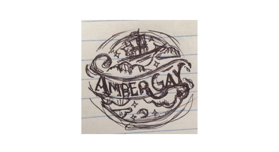
This is a short example of the creative process used for this sites main logo. Before any designs are created, research is done. A folder is compiled out of information about and from the client, several research images consisting of industry professionals, inspiration, color themes, etc. Once the research is completed, mood boards are built around specific style choices.

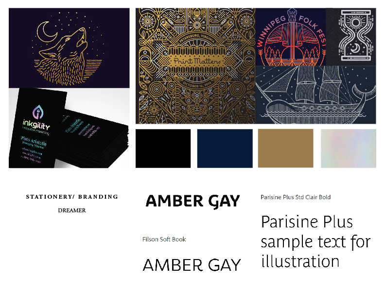
The two main style choices that lasted towards the end of this project were the "Edwardian Ad" and the "Line Art" styles.
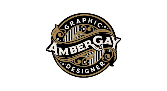
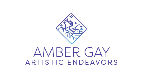
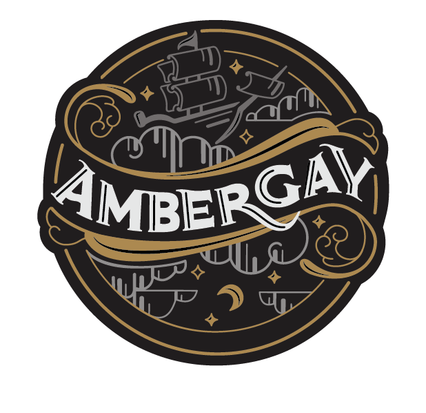
After several quick, thumbnail sketches, the top two were chosen and turned into rough vector art. Once the two designs were created, the client (myself) realized she was not completely happy with either. In order to fix this, a "hybrid" design was created from aspects the client really liked about both designs.
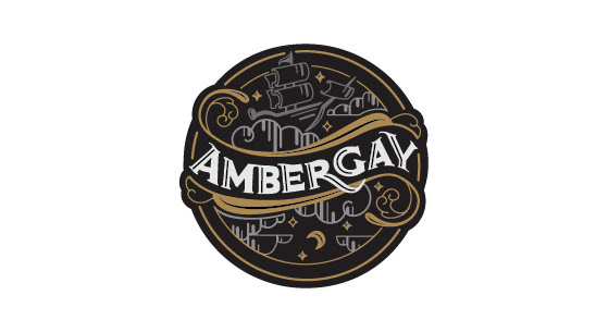
The final logo not only combines the two favorite art styles of the client, but also combines their love of vintage, their dreamer personality, and their love for illustration. A logo fit to identify the artist's artistic endeavors.